Bubblegum Pink
Posted 13th June 2021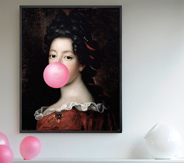
Whilst there are always lots of trends on our radar, the fashion world is certain that this year’s summer wardrobe will focus primarily on fresh, glorious and joyful colours. This represents a complete departure from the comfortable basics and neutral loungewear that many of us have relied upon for the previous 15 months of lockdown. The fashion houses have gone particularly crazy for hot bubblegum pink and are delivering anything and everything in the colour, with bright pink velour jackets by Mui Mui and similarly striking trousers by Chanel.
Ever since the renaissance of pink as Pantone’s Colour of the Year back in 2017, pink has featured as an accent colour in our interiors. Paired with greys, greens and navy blue, it has provided a perfect pale contrast to the muted tones we’ve favoured over the last few years, so much so that pink has become an increasingly popular colour to decorate with. But whilst the softer millennial pink tones are still relevant, I’m imagining that they will gradually make way for this punchier, brighter, bubblegum pink in the months to come, as interiors once again take their lead from the runways and catwalks of 2021.
It is certainly a statement colour! Bubblegum pink can be playful and charming, but it can also be dramatic and stimulating. It’s the prettier side of the colour red because where red can stir up feelings of aggression, passion and action, pink can also be seen as romantic and soothing. Whether your use of pink creates an invigorating or calming atmosphere will very much depend on the colours it’s combined with and the dominance of pink in the scheme.
The key to preventing pink becoming too feminine and girly is to pair it with strong dark colours.
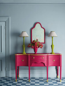
Hot pink and deep, forest green is being seen all over magazines, Instagram accounts and Pinterest boards. These two colours are being combined on walls and in homeware and even in kitchens. Green and pink sit wonderfully comfortably alongside each other because they are opposite each other on the traditional colour wheel. They are, therefore, much easier on the eye when put together rather than the contrasting colours of green and red.
Pink looks great in just about every room! It’s especially good in a dressing room where it can have a flattering effect on skin tone. Strong bubblegum pink is such a statement colour that even if you only use it on one piece of furniture, before you know it you’ve got a striking and impactful room with a bright and lively focal point.
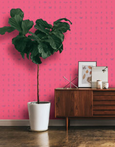
Pink walls sit well in a modern interior. They look daring and are vivid. Using a pink wall as a backdrop to a cool piece of artwork featuring a white or gold frame, or used in conjunction with a light fitting in a gold and crystal combination, pink will give the space an on trend look with the white, gold or crystal colours adding elegance.
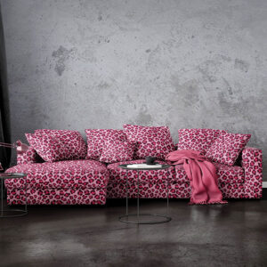
If you are not feeling brave enough to have a pink wall in your house then add a bubblegum coloured throw, cushion or vase. They are an easy way to add colour and impact without feeling like you are locked inside a pink fairy-tale palace.
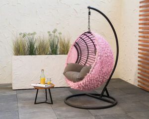
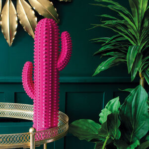
Pink tends to look it’s best when applied in an unexpected place – especially in a small room where you might not expect to find a pink wall. Try it as the backdrop to an open shelf or in a fireplace recess, or as the painted wooden base of a glass topped coffee table. A striking pink lamp base used as a contrast in a black and grey room can really illustrate the impact that a shot of strong pink can have and gives credence to the catwalks and interior influencers who are going so mad for the look.
 Rosie Kinsella
Interior Designer
01604 751262
Education
See All